
Churn is a recurring challenge for online platforms of every kind: e-commerce sites, streaming services, banks, telcos, even gyms. Any organization with an ongoing relationship with its customers or with subscriptions faces this problem. That's where user research becomes an essential tool for understanding it, preventing it and reducing it.
One way to monitor this attrition is through "Churn", an indicator that measures how many users stop using a service or cancel their subscription. But measuring churn on its own isn't enough. It's user research that lets you understand the reasons behind the metric and make decisions that actually reduce churn.
Beyond the metrics
On platforms built on a purely digital connection with their customers, it's tempting to rely solely on the user behavior data that the site's analytics produce.
Every transaction is logged in a database and we have plenty of metrics data in a direct, digital form (CPC, CPL, CHURN, DAU, MAU, WAU). So sometimes it seems unnecessary to get to know users better if we can monitor what they do through a metric.
But here's the thing. Metrics are extremely important and give us information about users so we know what they're doing. The problem is they don't tell us why they do it.
If a company wants to understand the why behind user churn in order to take action to avoid and prevent it, it's important to take on user research. And that's exactly what happened here.
Step 1: roll up your sleeves and read
The first step was to analyze primary sources of qualitative information and then turn it into quantitative data. This kind of work allows a first approach to users without even contacting them. It's about reusing existing qualitative information such as:
- Support emails
- Help desk tickets
- Free-text responses from CSAT or NPS surveys
Here you have to roll up your sleeves and read. Users know what they want and they tell you through every possible channel. The first thing we did was process all the emails coming into support and sort them by topic.
This process let us, on one hand, identify meaningful verbatim quotes that captured how users felt and, on the other, quantify how often each problem occurred. That way we could prioritize the ones causing the most frustration, especially those directly related to churn.
I want to pay and I can't!
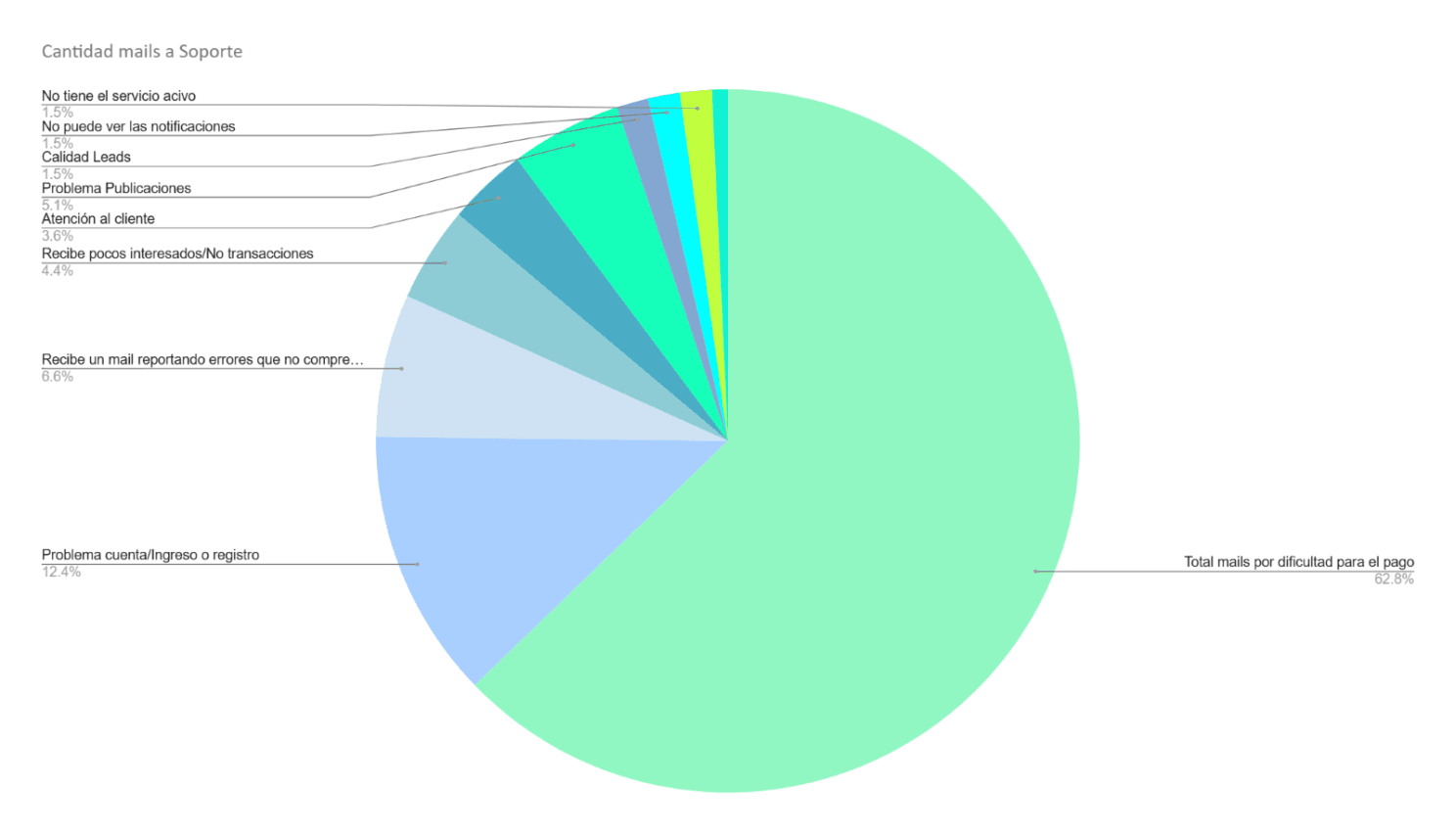
The research's first finding revealed that 67% of the emails to the support team came from users who wanted to pay for their subscription but couldn't do so because of problems on the platform. The main reasons were:
- The invoice wasn't available.
- There were too many payment methods, which caused confusion.
- Some payments weren't credited on time.
Many of these users expressed their frustration with phrases like:
"I need to pay for the subscription and I can't do it."
On top of that, we found a significant problem in the payment reminder email. The message sent a few days before the due date read:
"Your subscription has expired"
"Your monthly subscription expires in X days"
This alarming tone created confusion and panic, causing frustration among users. As a result, some people, frustrated, abandoned the platform.
An unexpected plot twist
The most surprising finding of this research was discovering that churn was being measured wrong!
These people who were still customers but couldn't pay because of technical difficulties in the platform itself sometimes fell into the churn metrics, causing an intermittent churn reading that confused the team.
Step 2: define and redefine the metrics
What we talk about when we talk about churn.
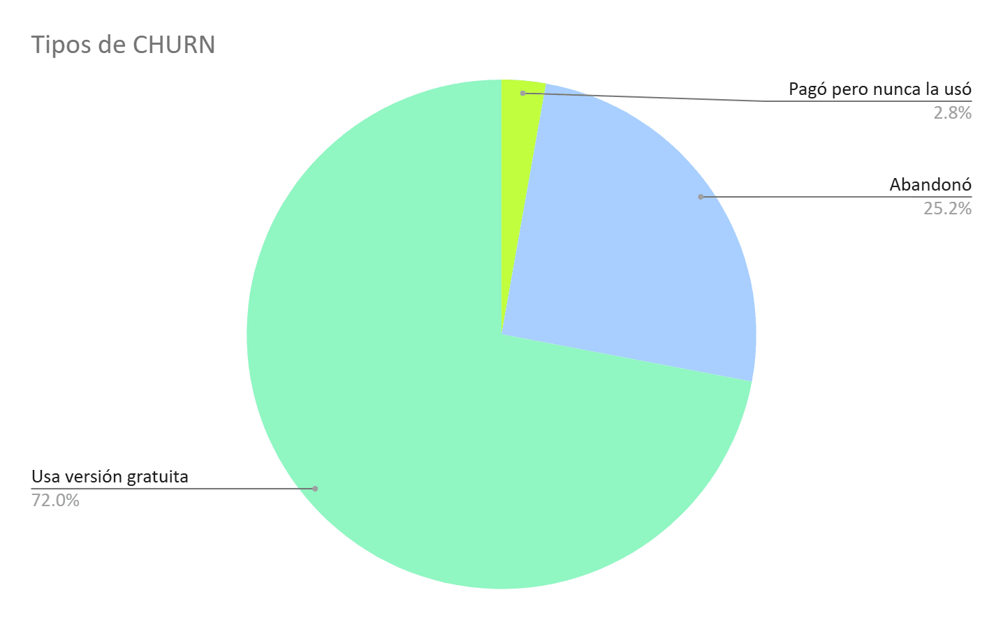
- All these people who couldn't pay because of technical and bureaucratic difficulties fell into the "bucket" that measured churn, producing false and inconsistent metrics, since once they caught up they came back as new users.
- There were people counted as churn who didn't pay but kept using the platform's free version every day.
- There were others who never used the platform even after paying once, yet still showed up in churn.
An experience of frustration
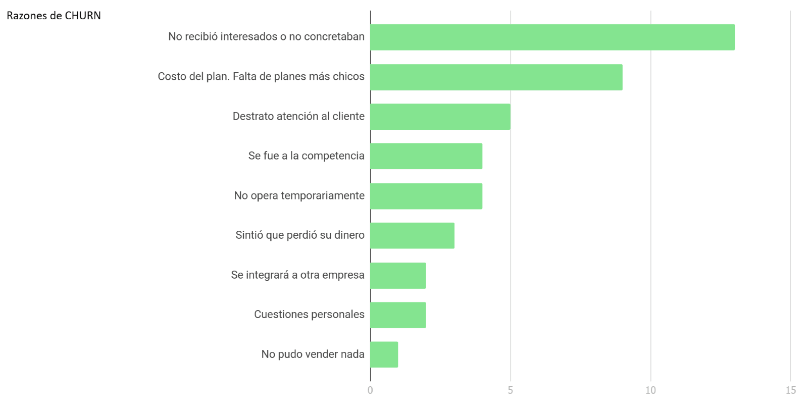
We analyzed the free-text fields from the NPS surveys, focusing especially on the low-scoring responses. This qualitative analysis let us identify key insights and group the comments by theme to determine the highest-impact problems. The main findings were:
- Low performance in lead delivery: users felt the platform didn't generate enough business opportunities.
- Poor treatment from the support team: several comments highlighted negative interactions with the people handling their accounts.
- Delays in activating the service: the excessive time between signing up and being able to use it caused frustration.
- Lack of product exposure: many customers believed the low lead delivery was due to a lack of advertising investment by the company.
- Plans out of proportion for small businesses: some users felt the minimum plan was too expensive and too broad for the number of products they had to offer.
Step 3: interview the users
With all this initial information in mind, we ran interviews that confirmed the issues identified in the primary sources. These interviews not only validated our findings, they also added depth and a more human perspective to the users' experiences.
A recurring case was users who experienced significant delays between paying and having their accounts activated, along with no response from support for weeks. Many described their experience as feeling "scammed", which reflects a strong impact on their perception of the service.
Another key finding came from a customer complaining about receiving "few leads". When we asked —what did "few leads" really mean and how many did they expect to receive?— they shared a revealing figure:
This contrast made clear not only a performance problem but also the need to manage customer expectations better and ensure the platform's perceived value is competitive.
Something the numbers weren't saying
The interviews also revealed something the metrics didn't show: our platform, not being local, had a marginal share of the market against the e-commerce site best known and used by most buyers.
They also revealed that users were migrating mainly to that competitor dominating the market. This finding exposed a business problem, which was handed off to the strategy team for analysis.
Step 4: cross-referencing results with platform data
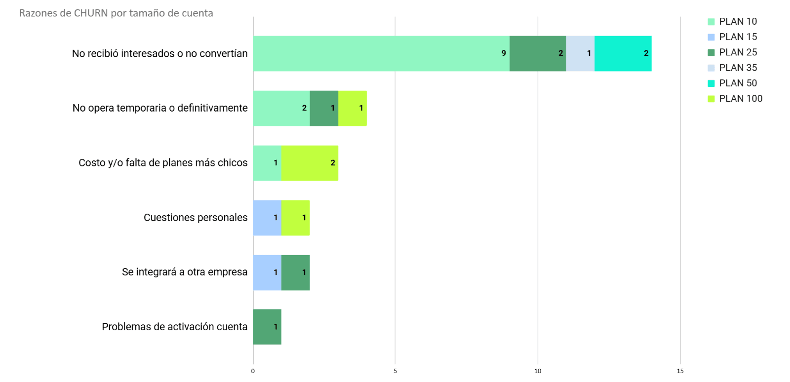
With all this information gathered, we cross-referenced the problems of the interviewed users with the behavior and account-type data we had on the platform. The findings were:
- "False churn": a significant share of the users showing up in the "Churn" metric were actually still using the platform daily on its free version. This indicated that the definition and measurement of churn needed to be reviewed to avoid misleading data.
- Users on the cheapest plan: the most frequent complaints about post-sale support came from users on economy plans. This could be related to the fact that the people handling support worked on commission, which may have worsened the level of service offered to these accounts.
- Leads on economy plans: while you'd expect economy plans to generate fewer leads, we found that they not only received fewer in absolute terms, but the amount was disproportionately low compared to premium plans. This suggested a possible problem in the exposure algorithm for the cheaper plans.
- A free version that was too appealing: the free version offered so many features that many users saw no reason to opt for a paid plan. This imbalance hurt the conversion of free users into paying customers, a key challenge for the commercial strategy.
This analysis let us identify critical points affecting both the customer experience and the accuracy of the metrics.
Conclusions and improvements implemented
Based on this research, we implemented several key changes to address the problems identified and improve both the user experience and the accuracy of the metrics, especially in how churn was measured.
- Optimizing the self-service portal: the system was updated to make it easier to access invoices and simplify the monthly payment process.
- Reviewing communications: the text of the reminder emails was changed so as not to alarm customers unnecessarily. The message "Your subscription has expired" was replaced with "Renewal notice", reducing the anxiety and frustration of the earlier communication.
- Adjusting post-sale service for economy accounts: since support ran on commissions and there was no structure to grow the team, we chose to clarify the offering for economy accounts, removing the expectation of personalized attention for these subscriptions.
- Reducing features in the free version: to encourage migration to the paid versions, we limited some features of the "Free" version, making it less appealing as a primary option.
- Analyzing the lead delivery algorithm: we started a technical review of the algorithm and the lead assignment process for economy accounts, to identify and fix the inequality in exposure.
- Focusing on higher-value accounts: while the technical issues were being resolved, we prioritized acquiring customers with mid-value and premium accounts, which showed higher levels of satisfaction and performance.
- Reviewing the churn metric: the definition of "Churn" was adjusted to exclude users who became active again after a brief period of inactivity. This produced more accurate metrics that better represented customers' real behavior.
These measures not only helped tackle the main causes of churn, but also optimized the customer experience and aligned business strategies with the needs we'd identified.
Bonus: artificial intelligence to predict churn
Although it wasn't part of the research we described, using artificial intelligence (AI) and machine learning is a highly effective strategy for preventing churn. These tools let you identify users at risk of leaving and act in time to retain them.
How does it work? First, historical data is analyzed to find patterns among users who left the service: behaviors, common characteristics or key moments when they decided to go. Then, with the help of algorithms, models are built that apply these patterns to current users, predicting who might leave. With this information, companies can take steps such as:
- Offering personalized discounts or benefits.
- Sending messages tailored to each user's specific needs.
- Reaching out directly to solve problems before it's too late.
AI doesn't just let you get ahead of churn, it also helps improve the customer experience and make better use of resources to retain the most valuable users.